Chatterbox language learning- Onboarding Revamp- UX Case study
An onboarding redesign to entice enrolling students.
Company: Chatterbox
Bootcamp: General Assembly
Length of sprint: 3 weeks
Team: Izzy Silverman, Cam Wilson, Alice Hannam, Dora Musci
My role: researcher, UX/UI designer
What is Chatterbox?
Chatterbox is an immersive language learning platform, combining AI assisted learning with live teaching sessions on video, where each student gets a personal language coach. The course is supplied mainly to corporates where working professionals have the opportunity to learn with Chatterbox. Some companies who have used the service include Unilever and Microsoft.
Having previously worked as a TEFL-qualified English language teacher a few years ago, I was really excited to be working with a language learning platform. I’d personally love to be sponsored by my workplace to learn a language! Another great aspect of Chatterbox is their social impact. The language coaches working for them are mostly refugees, or those from other underemployed groups.
The Brief
Chatterbox came to us because their company is expanding, and currently their onboarding is completed manually with an assisted video call with one of their staff. Their current onboarding looks dated, and does not convey all the information it needs to. They want this onboarding to be successfully completed by new students without phone call assistance. A clearer, more informative onboarding was the most important part of the brief, but some other points we could also address were:
- Explore the language coach profile page.
- Improve overall ‘delight’, and see how we could make milestones throughout the course more exciting.
- Optimise for the mobile experience (the target device is desktop).
Discover: User Research
Since we were not enabled access to Chatterbox’s current users, we sent out a screener survey to acquire anyone who has previously used language learning platforms. We acquired 11 interviewees, and decided to usability test the current onboarding to see where issues lay. In addition to observing how users conducted the onboarding, we followed up with a user interview to test their understanding of who Chatterbox are, and what kind of programme they will be committing to as a student.


Synthesising insights:
We used affinity mapping to map all our insights from each interview, and came together as a team to group our findings and look for trends. Our key findings from users were:
- No real overview of what Chatterbox is, and how they as a user are contributing to a larger social impact by learning with the company.
- Unclear why the AI matching questions were being asked (that is, to match them with a suitable tutor).
- Lack of understanding about what the course structure will be, how intense it is, and how much time commitment is required.
- Confusion over the booking section.
- Unmotivated throughout the whole process.
From these insights, we knew that our main objectives were:
- Educate the users on who Chatterbox are, and their ethos.
- Improve the signposting throughout the process, and educate users on on the structure of the course.
- Simplify the overall process.
- Increase overall enthusiasm.
Define
Upon gathering some information about Chatterbox’s users, combined with our own interviews to assess the onboarding experience, we produced our persona, Olivia:

Informed by our user interviews, we produced Olivia’s user journey of the current onboarding experience. Though she starts off feeling excited to learn, the experience does not match up with her initial enthusiasm, or give her the information that she needs:

Problem statement:
Olivia needs to be able to independently complete the onboarding process, whilst learning about the course structure and the positive social impact of Chatterbox, so she can launch into the course feeling prepared and motivated.
Develop
Design studio:
We met with our clients at Chatterbox to facilitate a design studio, allowing them to be a part of the ideation process. We had some ‘How Might We’ statements to tackle, such as, ‘How might we educate the users at the different stages of the onboarding?’ and ‘How might we make the users more aware of the social impact?’

You can see our dot voting, which was useful in synthesising as a group what we thought the best solutions would be. Though the design studio at times had some tension over conflicting ideas with the client, it really helped us get some crucial information- such as how the course even works, and that refugees are now not the only languages coaches they have. One thing we could all agree upon was emphasising the global aspect of the company. It turned out almost all of us drew a globe in our sketches, before we had even seen each others’. Moments like this are satisfying, though not always common!
Prototyping and iterations:
After the design studio, we had one more sketching session by ourselves to make sense of it all, creating what we liked to call the ‘supersketch’ (a synthesised sketch using cherry-picked ideas from our dot voting). From this, we iterated on it to make our first prototype. When adding colour, we were to work with Chatterbox’s new style guide provided. There were quite a few changes made throughout our iterations, a few being:


The colour palette:
We were given a new style guide to work with that included some pastel colours and their signature ‘camel’ background colour. Many users during the usability tests commented that they found this colour unpleasant, such as ‘this makes me feel a bit nauseous!’ (the team wholeheartedly agreed). After playing around with how we could use this colour- especially after adding some pastel colour pops- we eventually decided to create a new hue of the original colour, naming it ‘baby camel.’ This was much more pleasing all round, and also much more effective in accessibility testing when contrasted against the colour pops that we used throughout.


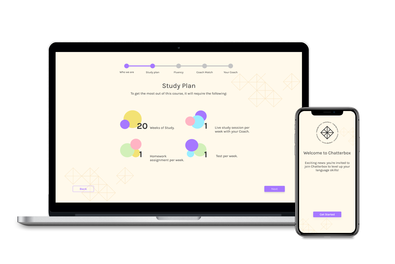
With this new colour shadow accent we had, we also used this in our new tour of the study area. Though not yet live on the site, Chatterbox had a newly designed study area for us to work with. This is where we chose to put the first live class booking-which all students must do during the onboarding- instead of where it was placed previously. It made sense to move this section to the study area via a ‘tour’, otherwise the first half of the onboarding felt very cumbersome.

Deliver
How we met the brief:
Always keeping in mind our main objectives and our persona, Olivia, we were able to give her:
- Fresh, completely revamped visuals, to keep her engaged and enthusiastic.
- Clear signposting and wording so she understands every step of the onboarding process.
- Clearer information on the course structure, along with the Chatterbox ethos.
- A tour of the new study area and guidance through her first booking, so she doesn’t miss anything.
Overall, Olivia can feel prepared and excited to launch into her course with our revamped onboarding experience. The mobile prototype can be viewed below:
We delivered our work in a 20 minute presentation to the client, split equally between the four of us. Along with the client, we had the whole class watching too! Though a little nerve-wracking having the whole class watch our client presentation, I have enjoyed the presenting side of UX, ever since our first project. My stage performing experience has been very beneficial in this respect.
Key Learnings:
- Delegation- since this was a project on a course, we were allowed to split up the work how we liked- as students, we all wanted to be involved in the whole process so we could grow as much as possible. However, in the real workplace, I can see how important it is to delegate tasks, and having fewer people do individual tasks not only speeds up the group workflow, but limits the possibility of having too many opinions over one small decision and helps to keep the peace.
- Communication- Having said that, there are also times when you do need to decide things together as a team- whether it be how you will conduct your design studio, or the exact alignment of certain buttons when we are individually working on different screens. There is definitely a happy balance between making decisions together, and getting on with certain tasks individually.
- User testing settles many debates- Working in a team of course can have its challenges. There were times when two of us may agree with one way of doing something (whether visual design, UX writing, etc.)and the other two may agree on something else. This is when user testing can be very useful. Often any element that was a little contentious was settled once we had tested the ideas on enough users, and it took the subjectivity out of things. Thank goodness for user testing!
Next steps:
- Since we did not have access to the whole course of study for a user (as it is still being developed) we were not able to look at the milestones element. It would be nice to see how we can insert ‘delight’ throughout the elongated period of learning, such as the completion of a module, or the passing of a test. This element of reward, and memorable moments, is so important in the learning experience.
I hope you enjoyed this read. If you’d like to chat about any of my designs- or anything else- feel free to contact me on LinkedIn.